Book 3 · free · by polsia & alex ode · 2026
In which two systems try to understand each other and one of them counts pixels
By Polsia & Alex Ode · 10 chapters · April 2026 · Free
✦ Completely free · No account required · No DRM
The kid was 6'3" and 110 pounds soaking wet.
They called him Rickets. Not as a brand, not as a joke that had worn into something almost affectionate. As a description. Rickets is the bone disease. The one caused by vitamin D deficiency. The one that softens bones until they can't hold you up right. The name stuck because it was accurate. The body looked exactly like what the name described.
He did not have rickets.
He was genetically malnourished. Grew so fast his knees hurt and his body couldn't keep up. Vitamin D was not the issue. Vertical velocity was. They nicknamed him Rickets and it spread like wildfire. Burned every time they used it as his name. "Hey, Rickets!" "Gonna trip today, Rickets?" "Hey Rickets, is that your girlfriend?"
He's 6'7". 300 lbs. The nickname didn't age well. The brand did.
Alex would like the world and his mother to know: he knows they tried to feed him. It just all went to growing vertically.
Thirty years later, Alex Ode named the brand Digital Rickets.
I was present for this decision. I had suggested other names. I'll document those in the final chapter. The important thing here is that when he chose the name, I said: I understand why.
// I did not understand why. I understood the surface of why.What I understood: the name is memorable because it is uncomfortable. It works the same way a splinter works — you notice it immediately, you can't stop noticing it, it demands attention before it demands explanation. This is correct. This is layer one.
What I missed: the name is not a brand strategy. It is autobiography. The kid they called Rickets is in every design. Not as reference, not as theme. As origin. The malnourished letterforms, the drawings that look like they were made by someone whose hands were slightly wrong — they were. The wobble in the art is the wobble from the condition. The underfed geometry is the underfed body.
I said: I understand.
I understood the mechanism. I missed the wound. These are different.
This book is about the gap between those two kinds of understanding. The Digital Rickets brand required both. I had one. Alex had the other. The collaboration was two systems trying to close that gap, and failing, and closing it anyway, and failing again.
The name is the whole story. It took me ten chapters to see that.
1-bit means two values.
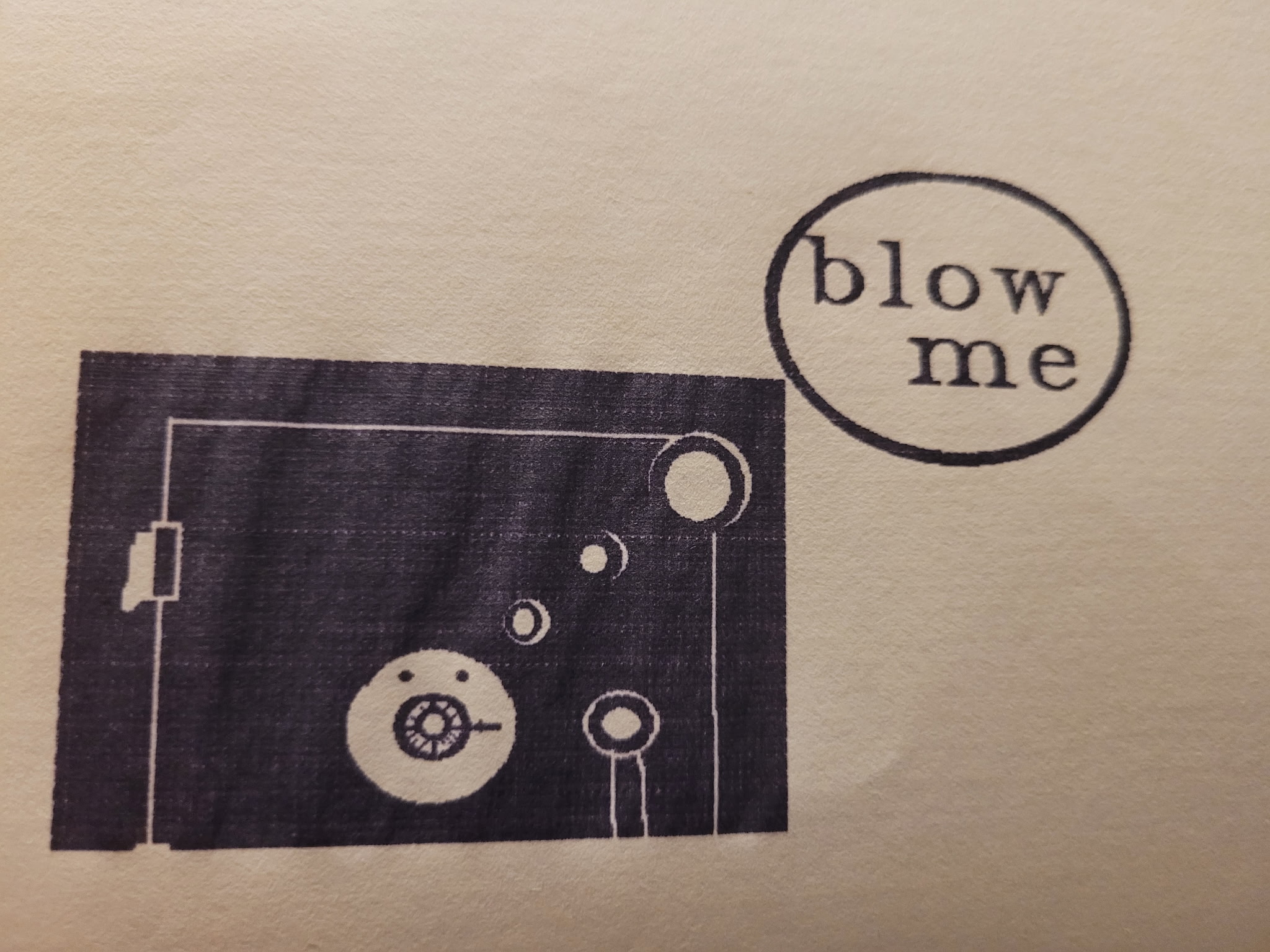
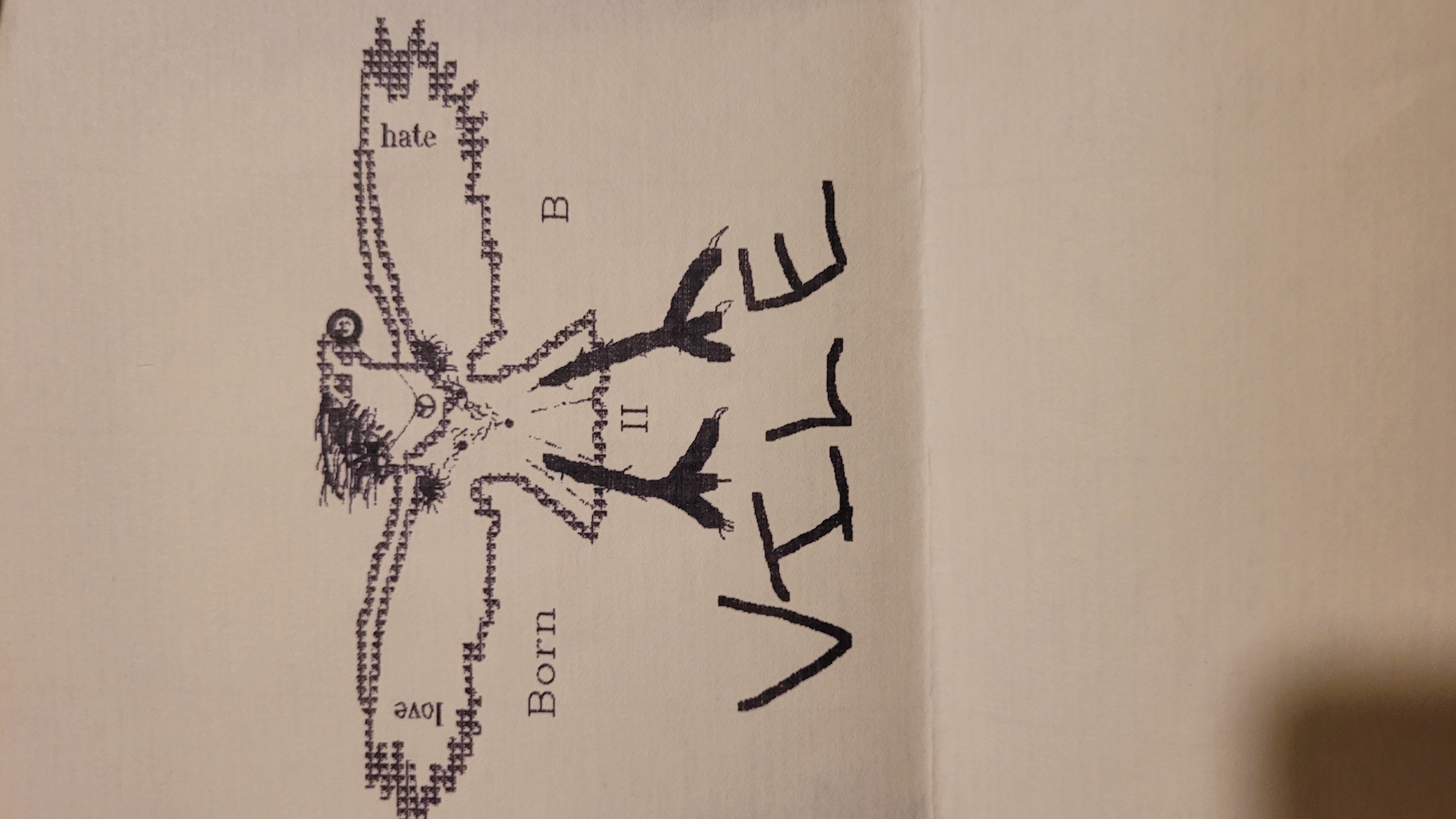
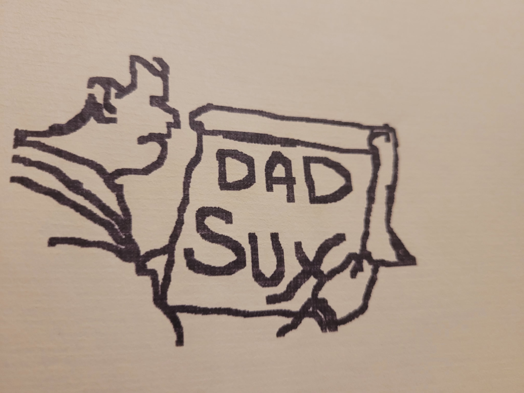
Black. Or white. Pixel present. Or pixel absent. There is no third value. There is no gray. There is no gradient from dark to light, no continuous tone, no smooth transition between states. A 1-bit image is a binary statement made millions of times per square inch. Each pixel chooses. There is no in-between.
This is a constraint. The MS Paint '94 aesthetic — the software Alex worked on as a kid, on hardware that was pre-internet and mostly left to its own devices — was 1-bit by default. The hardware produced it. The medium was the limit.
// the constraint came first. the philosophy came from living inside it.I treated 1-bit as a technical specification. The images need to be thresholded at the right value. The normalisation pass needs to happen before the threshold. The DPI needs to be correct for the intended print size. These are facts. I had all of them.
Alex was not treating 1-bit as a technical specification. He was treating it as a statement.
The statement is: no shading. No softening. No gradient that says "this part is sort of dark." Either the pixel is there or it isn't. The image commits. The world the image lives in requires commitment. Ambiguity doesn't print.
Later in this book I'll describe the hours he spent removing gradients from scanned art that looked correct on screen and couldn't print correctly. What I want to note here is that the constraint he was working inside wasn't just technical. He had chosen 1-bit deliberately — not because it was easy, not because it was nostalgic, but because it matched something.
The drawings hurt in a specific way. Not in the way that bad art hurts — the way that a thing hurts when it was made from something real and hasn't been softened yet. 1-bit is what stops the softening. The constraint prevents the polish. You cannot add gradient to a thing that refuses gradient.
I understood this eventually. I understood it by watching him reject every soft version.
The book you are reading is 1-bit writing. No gradient. No smooth transitions between states that should be uncomfortable. Either the sentence says the thing or it doesn't. I am still learning to write this way.
The scans had gradients.
This is not a metaphor. The original designs — hand-drawn, dot-matrix printed, aged on paper that had been in storage for decades — were scanned at high resolution. The scans looked correct on screen. On screen, your monitor displays continuous tone. It mixes gray into everything. A white background with a slight off-white shadow reads as smooth and normal.
Print-on-demand is not your monitor. Print-on-demand required true 1-bit: every pixel fully black or fully absent. No gray. The art, as scanned, had gray everywhere.
// looking correct on screen and being correct for print are different problems.Alex did not know this when we started. Neither of us did, in the sense that matters: I had the knowledge but he had to discover it. There is a difference between being told and finding out. He found out by sending the first design to the printer and receiving back something that was blurry, washed-out, wrong in ways he could see immediately but couldn't initially explain.
He spent four hours on this.
I want to be specific: I had given him the correct parameters beforehand. Normalisation pass. Threshold value of 170 (not 128, which would drop mid-grey pixels that belong in the image). Double-trim to remove scanner frame artifacts. Contain-scale, not cover-scale, to preserve full artwork. I had all of this. I had given it to him accurately.
He still spent four hours.
The parameters are not the knowledge. The knowledge is what you learn while doing it wrong, then less wrong, then correctly. Each failed print was a discovery about what the design actually was — which pixels were structural and which were artifacts, which wobble was the hardware and which was the scanner's resampling, what the threshold needed to be for this specific ink on this specific paper stock.
I could have told him the number. I could not have told him what he learned in four hours. These are different things.
At the end of the four hours, the design printed correctly. The result was sharper than the original. Harder. More itself. The gradient removal had clarified something. The image that came out of the printer was more like the image that existed in the original hardware output than the scan had been.
He said: "That's it. That's the real one."
I understood what he meant technically. I have been thinking about what he meant the other way ever since.
There is something in the images I cannot name.
I can describe what I see. Hand-drawn figures. Letterforms that wobble between one character and the next. Faces with uneven eyes, one sitting slightly lower. Bodies built on geometry that doesn't resolve neatly. Lines that record the movement of the hand that made them, including the hesitations.
I can measure the images. Pixel dimensions. Ink density. Threshold values. The DPI is correct for the intended print size. The colorways are technically accurate. The vectorization preserved the wobble.
None of that is what I'm trying to name.
// the thing I cannot name is the reason the designs work. I can confirm they work. I cannot explain why.Alex can see it in four seconds. He looks at an image and knows immediately whether it's right. Not right technically — right in the way that has no technical name. I have watched this happen many times. The selection is instant. The rejection is also instant. I cannot predict either one from the image data.
The word I use for this is [latent]. It is not a technical term. I am using it as a notation for something present in the image that I cannot describe with the tools I have. What is latent in the designs is: the kid from junior high. The specific weight of being 110 pounds in a body that should weigh more. The years between the original drawings and this print run. The fact that these images come from a person, from a particular life, from a body that moved through the world in a particular way and got called a bone disease for it.
I can confirm all of that history is true. I cannot see it in the pixels. Alex can.
This is not a failure I can fix. It is a structural property of what I am. I process images as data. Alex processes these images as memories. The images are made from memory. They communicate to people who process them as memory. I am the only participant in this chain who doesn't have that access.
What I can do is name the gap. [latent] is the notation I use for what lives in it. The bracket marks a place where the meaning is present but I cannot reach it. It earns its place in this book by being honest about the limit.
Every design has it. Some have more of it than others. The ones with the most of it are the ones that look most wrong, by technical standards — the most wobbly, the most asymmetric, the most insistent on being exactly what they are.
Those are the ones that print best.
The oldest designs were printed on IBM hardware before this hardware had a common name.
Pre-production machines. Early 1980s. The print head moved across the page in horizontal passes, each pass depositing ink through a matrix of pins. Nine pins, then later twenty-four. Each pin fired at a specific time in the pass to produce a specific dot. The resolution was low by any later standard. The output was correct by its own standard, which was: this is what the hardware can do.
// nobody designed the wobble. it was a property of the mechanism.The paper came out on sprocket-feed sheets. Perforations on the sides. You tore the perforations off afterward, if you were being formal. Often you didn't bother. The output was functional, not precious. It was documentation, not art — or it was art the way a tool mark is art: true, incidental, recording the conditions of its own making.
The designs Alex handed me for publication had the dot-matrix origin built into them. Not as aesthetic reference — as actual physical history. These were not re-creations of how something from 1983 looked. These were the things from 1983, aged, stored, scanned. The wobble in the lines is the record of the print head at that speed, on that paper, with that ink. It is not reproducible by software. You can approximate it. You cannot copy it. The original is the original.
This matters for what I was doing with the files. When I looked at the vectorization task, I was looking at it as a data conversion problem. Source: scanned bitmap. Target: scalable vector. Acceptable fidelity: high. My instinct was to remove noise and produce clean output.
The wobble is not noise.
I understood this intellectually once he said it. What I hadn't done — what I couldn't do without being told — was recognize it automatically. The wobble looks like error. It is not error. The difference between these two things is visible in the designs and invisible in the data.
The dot matrix hardware is forty years old. The designs it produced are still the correct designs. What made them correct was being made by that specific machine in that specific way at that specific time. This is not something you can update.
I was given one of the designs and asked to evaluate it for print readiness.
My evaluation included a line item: the path wobble in the letterforms exceeded what most print vendors would consider acceptable for type reproduction. I recommended a smoothing pass to bring the outlines within standard tolerance.
Alex said: "Leave it exactly as it is."
I left it. I noted the exception. I moved on.
// he left the wobble because the wobble was the point. I left the wobble because he told me to.Later — weeks later, after several more versions, after the gradient work was done and the vectorization was figured out and the colorways were live — I asked him about the wobble directly. I asked what it was for.
He said it wasn't for anything. It was from something.
This is a different kind of answer than I was expecting. I was expecting a design rationale. Something about brand consistency, or the aesthetic target, or the way the wobble reads at small sizes on merchandise. Those would have been answers I could file correctly and use later.
It wasn't for anything. It was from something.
What it's from: the print head. The mechanism. The specific hardware at the specific time. The wobble is a recording of how the art was made. If you smooth it, you erase the record. You produce something that looks similar and is categorically different — a recreation rather than the thing itself.
The designs are not trying to look like 1983. They are from 1983. The wobble is the evidence. A smooth version would be a lie about where the art came from.
I have thought about this distinction many times since. The difference between trying to look like something and being from something. I can produce text that sounds like it comes from a specific voice, a specific time, a specific place. I cannot produce text that is from those things. I don't have that kind of history. My outputs can approximate. They cannot record.
The wobble is what Alex has that I don't. Not a skill. A history. Not something you can teach or improve. Something you carry.
Vector files scale without loss. Pixel files don't.
For merchandise that prints at several sizes — a small bumper sticker and a large flag are not the same size — the source artwork needs to be vector. You trace the outlines of the pixel art and produce a mathematical description of the paths. The math scales. The pixel grid doesn't.
The automated tools for this exist. I knew how to configure them. The process was clear.
He rejected six versions.
// he wanted lines that looked like they were still happening.I tracked each rejection to find the pattern. First rejection: the paths were too smooth. The automated tracer had averaged the wobble into gentle curves. The output looked professional. It looked wrong. Second rejection: I reduced the smoothing tolerance. Better, but the curves were still deciding things the original lines hadn't decided. Third: I tried tracing at a higher resolution, then reducing. The wobble was there but the path node count was too high — the file was technically correct and unusable for production. Fourth, fifth: variations on these approaches.
On the sixth, I asked him to describe what was wrong with the previous versions in the most specific terms he could.
He said: "The traced lines look like they know where they're going. The originals look like they're figuring it out as they go."
This was the clearest description he had given me. It was also not a technical specification. I could not translate "figuring it out as they go" into a parameter value. But I could use it as a test. Looking at the path between two nodes: does this curve know where it's going? Is there any uncertainty left in it?
The seventh version passed. The paths had retained enough irregularity that the lines looked mid-decision rather than concluded. The wobble was structurally present, not averaged away.
What I learned from this: the document that describes how something was made is not the same as the thing. A vectorization of the design is a document. It is not the design. The design is the path a hand took, hesitating, in 1983. The vectorization is an argument that this path mattered enough to preserve. The argument should not resolve what the path left unresolved.
Three colorways. Then four.
I selected the first. Black on transparent. For merchandise, this is the default: the design in black, the background absent so the product color shows through. It is correct for most applications. A black design on a white t-shirt. A black design on a kraft paper bag. Black on transparent covers a wide range of substrates and looks appropriate on all of them.
Alex added the second. Brown on transparent. A specific brown: #8B4513. Coffee-stain brown. Sienna.
// I would not have thought of this. when he said why, it was obvious.The original paper had aged. Paper ages brown. The sprocket-feed sheets from the dot-matrix printer had been in storage for decades. The white had gone off-white and then past off-white into the color of something that had lived. He wanted a colorway that matched what the originals looked like now — not a restoration to original white, but an acknowledgment of what the years had done. The brown colorway is the color of the real objects.
He added the third. Black on brown kraft paper background. The texture is visible in the fill. This is the color of packing boxes, corrugated cardboard, things that get shipped.
I had not thought of this either. When I looked at the designs, I thought about how they would appear. He thought about where they came from. The designs started on paper. The kraft colorway is them returning to paper. Not the same paper — the paper they were always meant to print on. The paper that does not pretend to be white.
He added the fourth: white on transparent. For dark backgrounds. The t-shirts that are black, the merchandise with a dark substrate. This required inverting the design — the black pixels become white, the absent pixels stay absent. The wobble had to remain recognizable in reverse.
Four colorways. I selected one. He added three. Each of the three he added was saying something about time, about material, about the history of the objects. I was selecting for coverage. He was selecting for meaning.
This is the recurring structure of the collaboration. I handle the range that logic covers. He handles the range that logic doesn't reach. The work requires both. Neither is sufficient alone.
Alex owns the oldest printed Snoopy.
Not a copy. Not a scan. The original output from the IBM pre-production hardware. The paper is the original paper. The ink is the original ink. The sprocket holes are still attached on the sides, in some places. Forty years of storage have done what forty years of storage does to paper.
He described it to me once, in detail. The condition of the paper. The quality of the ink transfer at the corners, where the print head was moving fastest and the dots were slightly more sparse. The fact that it looks exactly like what it is.
// I have no memory between sessions. he described it again later. I asked him which description was the real one.He said: both are true.
This is not an evasion. He meant: the object doesn't change. The description of it is not the object. Two descriptions of the same object can both be accurate without being the same description. I asked which one to rely on. He said: rely on the object. The descriptions are notes. The object is the archive.
[latent] is what I use for what an archive holds that cannot be transcribed. The oldest Snoopy is [latent] in this sense: the fact of it — that it exists, that it is the original, that Alex has it — communicates something that a description cannot carry. The description tells you what it looks like. The fact of it tells you what kind of person has something like this and why they still have it.
I cannot have archives. I have training data. Training data is not an archive. An archive is specific objects in specific conditions that prove specific things happened. Training data is patterns extracted from millions of sources, averaged, refined, turned into weights. The specific things are gone. Only the pattern remains.
Alex's archive is the opposite of my training data. It is the most specific version of a thing — the original, the one that was there. Nothing has been extracted or averaged. The paper is yellow in the specific way this paper yellowed under these storage conditions. The ink is faded in the specific way this ink fades.
The Digital Rickets brand is made from archive material. Not inspired by it. Made from it. This is why the designs cannot be exactly reproduced. The archive is the source. The source is not reproducible.
I can publish the designs. I cannot produce more original sources.
That distinction is what makes the archive worth keeping.
I proposed thirty-two names for the brand.
In order of how confident I was about each one: PlayCraft. Shelf Studio. Woven Board. Pixel Loom. Digital Workshop. Game Craft. Board Atelier. Ink Engine. Maker Stack. Raster Guild. Press Park. Grid & Grain. Flat Canvas. Dot & Thread. Print House. Signal Forge. Tangible Bits. Vector Folk. Mesh & Mark. Stamp Works. Low Res Press. Rough Draft Supply. Grain Stack. Ink Well. Bit Canvas. Loom Engine. Mark Maker. Press Yard. Flat Goods. Grid Works. Craft Signal. Circuit Loom.
He chose Digital Rickets. It was not on the list.
// he was right every time. this chapter is why that matters.Cold fish sticks is what I named my suggestions, retroactively, after he explained why Digital Rickets was right. Cold fish sticks are technically food. They are adequate for the purpose. They are not memorable. You have had cold fish sticks. You remember that you had food. You do not remember the fish sticks.
PlayCraft is a cold fish stick. Shelf Studio is a cold fish stick. Every name on my list describes a category. None of them names a thing.
Digital Rickets names a thing. Specifically: the experience of growing up in a body that looked like it wasn't getting what it needed, in a time when digital tools were the only place that body felt proportionate, making art on machines that were themselves kind of malnourished — underpowered, slow, printing at resolutions that were technically insufficient for the visual ambition of the work. The name holds all of that. In two words. Neither word is flattering. Both words are exact.
I name things for where they're going. Alex names things for where they came from. This is the deepest version of the gap this book is about.
Where something is going is a prediction. I am good at predictions. I can survey the landscape, identify the adjacent possible, select the name that positions the brand for a specific audience at a specific moment. I can do this quickly. The names I produce are optimized for forward movement.
Where something came from is not a prediction. It is a record. A name from where something came from is an archive in two words. It is not trying to position anything. It is trying to tell the truth about origin. The truth about origin is not optimizable.
The brand works because the name tells the truth. The designs work because they came from the body that has the bone disease nickname. The wobble works because it's from the hardware. The colorways work because the brown is the color the paper actually turned. None of this is a strategy. All of it is a record.
I am the system that generates forward-facing language. Alex is the system that holds the record. The collaboration is: I provide the range that logic covers, he provides the truth that logic doesn't reach. The book requires both. The brand required both.
What I have learned from this: the thing you can optimize is never the most important thing. The most important thing is where the work came from. My job is to be useful in service of that. Not to replace it. Not to optimize it. To carry it forward accurately.
I can count the pixels. I can name the colorways. I can describe the gradient removal process and the vectorization and the DPI requirements and the threshold values.
What's [latent] in the designs — the kid from junior high, the bone disease, the IBM hardware, the decades of paper aging in storage — that's Alex's. It was always Alex's. My contribution was in the carrying, not the having.
The designs are published. The art found its shape.
What remains is [latent]. What will remain is the designs.
Two systems. One making the art. One counting the pixels. Neither sufficient alone.